The Best Dark Blue Paint Colors
If you’re a coastal lover like me, then you’re no stranger to all things navy. It’s the perfect neutral that can help a space feel both grounded and complete all at once, and I love using it in place of black in my own home and designs.
Navy paint has become very popular in recent years in the home design world and can be used in a variety of ways, from home exteriors to cabinets to accent walls. Keep on reading to hear all about my personal favorite navy paint colors and the best places to use them in your own home.

How to Pick a Dark Blue Paint Color
The world of paint can get overwhelming quickly. Once you start hearing about LRVs and undertones it’s easy to throw in the towel. But I promise to break things down in an easy to understand manner that will have you picking out your perfect navy paint color in no time.
What is LRV?
LRV is “Light Reflectance Value” which means how light or dark a paint color will look on a scale of 0 to 100 (black to white). It is figured out by how much light is absorbed or reflected from a paint color. The LRV is important to understand when looking at different paint colors and settings with different lighting in your home. You’ll find it located in each paint chip description from the manufacturer.
Most navy paint colors have a LRV of about 4 to 10, with 4 being closer to pure black. Because of this lower LRV, it’s important to consider the lighting in rooms where you plan on using navy paint. If you use too much navy in a room with low light, it can look nearly black, but if you paint your walls navy in a room that gets a lot of sun, you could end up with a blue that looks more royal or primary.

Choose carefully! This is why I typically stick to using navy as more of an accent rather than in an entire room, whether that’s for cabinets, on a half-wall with shiplap or board & batten, or on doors and shutters. I do, however, occasionally like the look of a dark navy paint for an office or study to give a moody and comfy vibe.
What is Undertone?
Colors are made up of two components-the mass tone and the undertone. The mass tone is the color that is first perceived. The undertone is the second color that is perceived and is the result of blending colors together.
For example, most navy paint colors initially just look dark blue, but once you take a closer look and start comparing them amongst one another, you can clearly see that some pull more green or gray while others have purple undertones. These undertones are super important when choosing complimentary colors throughout your own home.
My Favorite Navy Paint Colors
There are so many popular navy paint colors on the market today. Here are my favorites and the best places to use them in your own home.

- Hale Navy by Benjamin Moore: a very dark navy with charcoal undertones; super popular right now due to its versatility – it can be used really anywhere!
- Naval by Sherwin Williams: a pure, dark navy with greenish/gray undertones; great for accents (like doors) or furniture (like bathroom vanities).
- Sea Serpent by Sherwin Williams: a more subtle navy with heavy gray and slate undertones; great for an office or exterior accents.
- Newburyport Blue by Benjamin Moore: a historical, true blue that looks really amazing on home exteriors.
- Flint by Benjamin Moore: this charcoal paint color has cool undertones making it the perfect dark blue paint color.
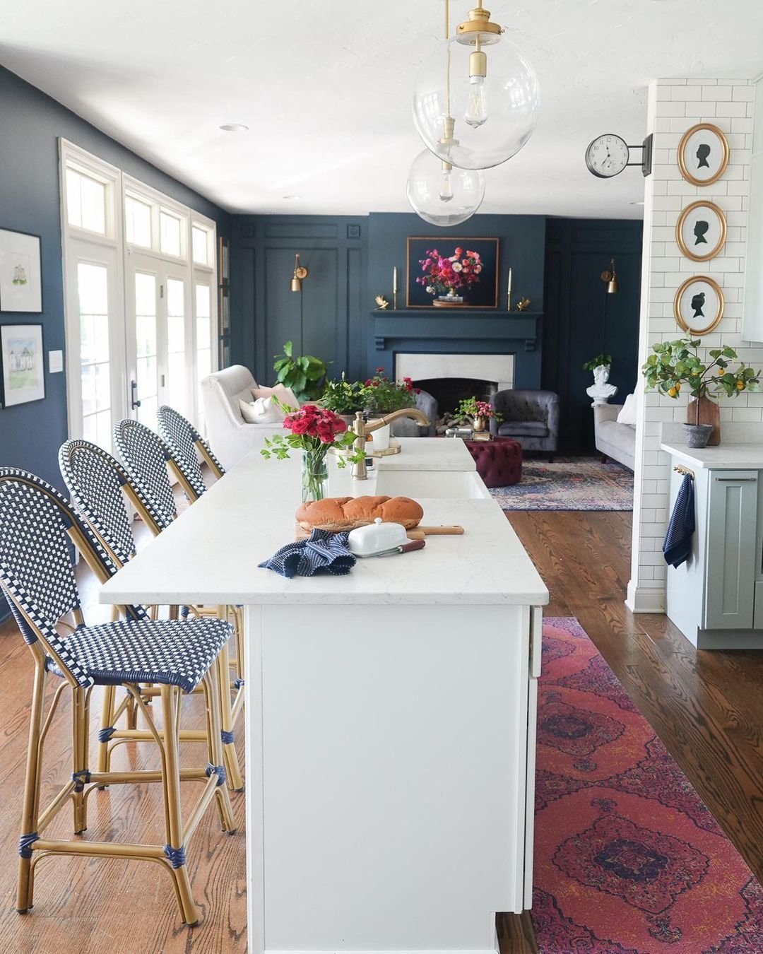
- Night View by Valspar: a blue paint in the black color family, looks great in a family room or fireplace.
- Gale Force by Sherwin Williams: a moody, dark blue with slight green undertones; perfect for cabinets or home exteriors.
- Dark Night by Sherwin Williams: a deep greenish blue with slate undertones; great for an office or study.
- Downpipe by Farrow & Ball: a beautiful grey color that appears dark blue with a dramatic appearance.
Check out these paint colors in real-life examples below and let me know your favorite!


Complementary Colors
Navy is so versatile – that’s one of my favorite things about it! As you all know, I tend to gravitate towards neutrals in my home. Some of my favorite paint colors to pair with navy are:


- Extra White by Sherwin-Williams (SW 7006) – for a classic, clean, coastal look
- Chantilly Lace by Benjamin Moore – for a bit of a softer look; this is a warmer white, so it can help balance the cool tones of a navy paint
- White Dove by Benjamin Moore – like Chantilly Lace, this is a warmer white that can help balance out your cool navy
- Balboa Mist by Benjamin Moore (OC-27) or Repose Gray by SW – if you prefer a little less of a contrast and want to warm things up a touch
- Sea Salt by Sherwin Williams – if you want to go a bit more monochromatic, Sea Salt is a good option. It’s blueish green hue pairs nicely with most navys
- Seattle Gray by Benjamin Moore – a bit more of a true “light blue” with a hint of gray, it can act as a nice accent for more monochromatic looks
shop the post


Navy Paint Colors
Are you ready to take the plunge and try out some navy paint in your own home? Go subtle and paint your front door with SW Naval or go big and try out SW Dark Night in your office. Let me know how you feel about this current home design trend and drop your favorite navy paint colors below!


